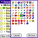
HandyShopper User's Guide: Preferences

As you may have discovered, HandyShopper is much more than "just" a shopping list program. While it was designed to be the most powerful and flexible shopping list program for the Palm OS platform, its success in that endeavor has also made it powerful and flexible enough to be used for hundreds of other purposes. With all this power and flexibility comes a lot of options and preferences. These are used to control how the list in use, or the program itself, performs tasks and displays information. This section will define all the various preference options, screen settings, and other switches and buttons in the program.


Initial List Preferences
Accessing the Preferences Screens
View Preferences
Columns Preferences
Sort Preferences
DB Preferences
Misc Preferences

Initial List Preferences


Figure 2.1
When running HandyShopper for the first time, and when creating a new database, you are presented with a few choices for the "Database style." (Figure 2.1) Database style just means that certain preference settings will be automatically set for you, so that you can get right to setting up your list without fiddling too much with the preference screens. The following database style descriptions indicate only the options that are CHECKED in the various preference screens for each list style. If a preference is not mentioned, that means it's not being used in that list style. For descriptions of what each of the following settings do, and what all the other settings do, please refer to the subsequent sections of this page.

  1. Shopping List:
    1. View: (no options marked)
    2. Columns: Quantity, Price
    3. Sort: Description (A-Z), Completed at bottom
    4. DB: Automatically reset quantities, Record item completion date
    5. Misc: Default Settings
  2. Shopping List - per-store prices: (same as normal shopping list, but with the addition of "Per-store prices and aisles" selected in Database Preferences.)
  3. To-do list
    1. View: (no options marked)
    2. Columns: Priority, Date
    3. Sort: Date (A-Z), Priority (A-Z), Description (A-Z), Completed at bottom
    4. DB: Automatically reset quantities, Record item completion date
    5. Misc: Default Settings
  4. Dated list
    1. View: (no options marked)
    2. Columns: Price, Date
    3. Sort: Date (A-Z), Description (A-Z), Completed at bottom
    4. DB: Automatically reset quantities, Record item creation date, Record item completion date
    5. Misc: Default Settings
  5. Check list
    1. View: (no options marked)
    2. Columns: (no options marked)
    3. Sort: Description (A-Z), Completed at bottom
    4. DB: Automatically reset quantities, Record item completion date
    5. Misc: Default Settings

Keep in mind that these are only to help get you started. If you start a Shopping list without per-store prices, you can always turn it on later. Likewise, by changing the preferences as above, you can turn a Check list into a Dated list, or To-do list, or even a Shopping list. List styles are just a quick and easy way to pick the most popular settings for those basic list styles right off the bat.

Armed with that information, you can choose which style you want to start off with. After you've given your new list a name and chosen a database style, you may also choose an icon for the list. An icon file must be installed and in RAM for there to be anything to choose. By default, HandyShopper chooses the first icon in the HS2Icons.PDB set. If no such named set exists, it will allow you to choose from a compatible icon set, including those for Agendus and DateBk5. To choose an icon from the available set, simply tap the Icon button (to the right of the Icon: text) and then tap an icon of your choosing. You may also choose "No Icon" if you don't have one you want to use. With the default icon set included with HandyShopper, choosing among the four main list types will also automatically select specific icons for the list: Shopping List gets a shopping cart icon; To-do lists get an exclamation point icon; Date lists get a clock icon; and Check lists get a checked box icon. These icons correspond to the first four icons in the icon set, and could show up as different icons if another set is found instead of the default set, or if the icon set has been edited.


Accessing the Preferences Screens

There are four ways to access the Preferences screens so that you can modify the program and list preferences.
  1. Graffiti command stroke: Writing "/R" in the graffiti area of your Palm device will open the Preferences screen, which shows the View tab by default. If the Preferences screen had been accessed previously, then the most recently viewed tab will be shown.
  2. Menu selection (Figure 2.2): Choose "Preferences..." from the "Misc" menu to access the Preferences screen. As with the Graffiti command, the Preferences screen will open to the most recently viewed tab.
  3. Actions Popup (Figure 2.3): Choose "Preferences..." from the Actions Popup. As before, the most recently viewed Preferences tab will be shown.
  4. Actions Popup: Choose "Sort..." from the Actions Popup. This will go directly to the Sort Preferences tab, which can save at least one tap when the Sort preferences are your goal.

Figure 2.2


Figure 2.3

View Preferences


Figure 2.4
The Preferences screen is separated into five different sections of settings. The sections are accessed by tapping named tabs at the top of the screen, just under the title bar. The first tab is the View tab. The View preferences (Figure 2.4) are general settings for how data in the list is displayed, including font sizes, and how many lines are allowed for each item. Each setting in the View preferences is described below.
  1. Show: [All/Needed/Not Needed] - This simply allows you to select which items you would like HandyShopper to list for you when you exit the Preferences screen. If "All" is highlighted, then all items in the list will be shown, depending on the Store and Category selections, whether they are needed or not. If "Needed" is selected, then only items marked as needed will be listed. If "Not Needed" is selected, then only items that are not marked as needed will be shown. This includes items that have been purchased but not those that are marked as needed.
  2. Hide completed (purchased) items in Need view: If this option is checked, then when you check off an item while in Need view, it will "disappear" from the list. It has not been deleted, and can still be found in the All view. This is useful when you do not wish to see items in the list that you have already purchased or checked off. If this option is left un-checked, when an item is checked off in Need view, it will be "struck out" and remain in the list. Struck out means that a line will be drawn through the item description.
  3. Only show items with coupons: When selected, only items with the "Coupon" box checked will appear in the list. This is useful for shoppers who try to only purchase items with coupons, or for other uses of HandyShopper where the coupon option is used. Keep in mind that ONLY items with the coupon box checked will appear, even if the item is not actually a coupon. The coupon box can be checked in the item details screen, or in the list view if the coupon column has been turned on.
  4. Round prices to whole numbers: When selected, all prices will be shown as whole numbers. The rounding functions as would be expected: all prices with .49 and lower will be rounded down (1.49 becomes 1) and all prices with .50 and higher are rounded up (1.50 becomes 2). The actual price entered remains saved, but the price shown in the list is rounded. If you tap the price to edit it, you will see the actual price entered. Again, rounding only affects the price shown in the list view, not the actual price as entered or the calculation of the totals.
  5. Max Lines: This setting controls the maximum number of lines of text displayed in list view for each item. The option provides a short pop-up list to choose from the following choices: Auto, 1, 2, and 3. When set on "Auto," as many lines for the item as will fit in the screen (including other items on the screen above it) will be displayed. For each setting 1, 2, and 3, only that number of lines will be displayed if there is enough text in the item description to fill it. For example, if an item has an extremely long description, and Max Lines is set to 2, then only two lines of the description will be displayed in list view. Note, however, that no matter the Max Lines setting, when the item is selected by tapping on it, all lines will be shown until the screen is full.
  6. Font: Simply put, this is the font the program will use to display the data in your list. Each HandyShopper list on your device can have it's own preferred font selection. There are four options for Font, the first three being the standard Palm OS fonts of normal, bold, and large bold text. The fourth selection is a special HandyShopper-only font that is narrower than the others, allowing more information to be displayed on a line.
  7. OK and Cancel buttons: Tapping the OK button will save the changes you have made in any and all of the preferences screens and return to the list view. Tapping the Cancel button will not save any changes and your preferences will revert to the state that they were in upon entering the preferences screen.

Columns Preferences


Figure 2.5


Figure 2.5.2
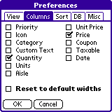
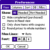
The second tab in the Preferences screen is the Columns tab. The Columns Preferences (Figure 2.5) allow you to select the fields you would like HandyShopper to display for each item in your list. While it is possible to have several columns shown in the list view by narrowing the width when possible, you can't make them ALL show up. Columns can be adjusted in width by dragging the "handle" for the column in the list view (see section on the List View). With a little tweaking and decision making, an ideal column selection can be made for any list purpose.
  1. Priority: The Priority column appears at the left side of the list view, the first column of data after the actual checkbox column (which always appears at the left-most side of the screen). Priority choices are made from a short pop-up list that includes the numbers from 1 to 5. No other data can be entered into the Priority field.
  2. Icon: Each item in your list can have an icon associated with it. When this column is turned on, a column of icons will appear immediately before the item description. Simply tap the "handle" icon (a small button) to access the icon chooser (Figure 2.5.2) to pick a new icon for the item. Items may still have icons assigned to them via the item details screen, and if the icon column is turned off, an item's icon will appear at the far right of the description field, after the note and alarm icons if present. No matter the location of the icon, a quick tap on the icon will bring up the icon chooser again. A tap-and-hold on the icon will switch directly to the details screen for that item. This column cannot be adjusted in width.
  3. Category: This allows you to select the category for each item in the list view from the user defined set of categories via a pop-up list. As with most Palm OS applications, categories are limited to 15 user categories, not including the Unfiled category. Category names can be up to 15 characters long, including spaces and other non-alphanumeric characters. The category column can be widened to more than half the screen, and narrowed down to five pixels.
  4. Custom Text: A somewhat unique field, this one can store any data you would like as direct input (no pop-ups). This field can store a whopping 255 characters! While the data can't be pre-configured and chosen quickly for each item, it's ability to store so much information, the same amount as an item description, AND to be another field for the list to be sorted by, makes it very useful for non-shopping list purposes. To enter text into this field, it must be shown in list view, as this field is the only one that is otherwise completely inaccessible in HandyShopper. When it's shown, simply tap the field to enter data into it as you would with the description field. This column can be widened to more than half the screen, and narrowed down to five pixels.
  5. Quantity: This field will accept any number up to 999999.999. Note that you can enter up to 10 characters, but if the actual number is above the limit, an error message will appear. Decimal places are rounded to the third decimal place. For example, .0059 would be converted permanently to .006. This is NOT a change for display purposes like the "Round prices to whole numbers" feature in the View Preferences. This rounding is real and permanent. Then again, what in the world would you need more flexibility in the Quantity field for, anyway? ;-) This column can be widened to more than half the screen, and narrowed down to five pixels. Since it can only hold a number as large as 999999.999, it doesn't do much good expanding the column width past that, but it's nice to be able to make it big enough for any number that fits that field.
  6. Units: This is a unique field in that you can choose from a pop-up list of user configurable selections (from a global list that all HandyShopper lists can choose from, limited to 50 user entered choices, limited to 15 characters each) and you can enter any text you want up to 15 characters. As such, if you have a field of data with 15 or less characters that you'd like to be able to sort by, you can use this field. If you need more than 50 different choices, simply enter them in the field directly by choosing "Other..." from the pop-up list of choices in the list view of your database. The Units field also has a new, higher purpose... It is now involved in the calculation of Unit Price! See the Unit Price description for more information on this feature. The Units column can be widened to more than half the screen, and narrowed down to five pixels.
  7. Aisle: Turning on the aisle column for your list can be very helpful when editing your shopping list to include aisles, as well as when shopping for your items to more efficiently move through the store. This column can be widened to more than half the screen, and narrowed down to five pixels, though making it wider than three characters has little value. It's worth noting that the Aisle column has it's own quirks. It can store any number from 1 to 200, AND from A to Z, which are all selected by a pop-up list. When you tap the Aisle data for an item, a very long pop-up list appears. You can move through the list to find what you want by scrolling with the on-screen arrows or with the hardware scroll buttons on your device. If your desire is for a high number, or a letter, both of which are very far down the list, you can make short work of selecting the choice you want by using graffiti to enter the first character. This will either skip all the way down the list to the first instance of the character you enter, or choose it automatically. For example, since the A to Z aisles are only one character, if you write the graffiti character for A, then A will automatically be chosen for you. If you enter the number 1, then a number 5, the list will skip down to the number 15. As soon as you enter another number, such as a 3, the number 153 will automatically be selected as the aisle for the item you are editing. If you only need a one or two digit number, writing the number, then tapping it in the list, or writing the return stroke in graffiti, will select it for you. Simply playing with this feature will help you understand how it works very quickly.
  8. Unit Price: This field displays the calculated price for one unit of an item. For Unit Price to calculate properly, the item must have a price, and a unit with a number in it such as "oz. 6" or "6 ounces." HandyShopper will then divide the price by the number of units in the item, to show you the Unit Price for that item. This makes price comparisons easier while still allowing for an accurate total. Quantity does not effect this calculation, and the Unit Price has no bearing on the total cost calculations, so you can still choose "2" for Quantity, and "$1.99" for Price, while having a Unit of "6 ounces" to calculate a Unit Price of $.332. :) Yes, this can get somewhat confusing. Just remember that HandyShopper needs a number in the Units field to calculate Unit Price. :) With the Unit Price column displayed, tapping on it will bring up the Best Buy calculator with the item's details pre-filled in the "Item B" area. Entering a price and number of units for another item allows for quick and easy comparison shopping. This field can also be widened and narrowed quite a bit.
  9. Price: Similar to the quantity column, you can enter any number up to 999999.99. Rounding for price now occurs at two decimal places, though. Any number too large to show in the list will be replaced with ##. To avoid this, widen the column, which can be widened to more than half the screen, and narrowed down to five pixels.
  10. Coupon: This column is another checkbox. It's called coupon because you can use the "Only show items with coupons" feature in the View Preferences to filter out all items that are not marked as coupons (or having a coupon to go with it). That is essentially the only purpose of this column, but some users have been known to use it as a sort of temporary checkbox, or reminder checkbox. To effectively use the coupon checkbox for coupons, you need to check the box for all items in your list that you have coupons for, then create duplicates of all those items (also with the coupon box checked, and maybe a slightly different item name, such as "Macaroni (coupon)") but with the value of the coupon entered in the price field as a negative number. With appropriately assigned quantities, the total calculated by HandyShopper will be accurate including the coupon discounts. Using the "Only show items with coupons" option in the View Preferences can make it easier to shop with coupons by hiding all the items for which you have no coupons. This column cannot be widened or narrowed because it is just a checkbox.
  11. Taxable: Provides a checkbox in the column to designate if the item is taxable or not. In many places, some items are taxed, and some are not. To make sure your totals are accurate, make sure to 
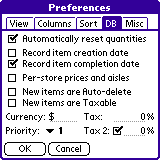
mark only those items that are taxed. If the Tax 2 option is enabled in the Database Preferences (explained below) then an additional taxable checkbox will appear. The tax columns will then be labeled T1 and T2. This column cannot be widened or narrowed because it is just a checkbox.
  12. Date: Shows the assigned date for the item. This column can only be displayed two ways, one showing mm/dd, and the other showing mm/dd/yy. There can be only one date stored per item, which can be assigned automatically upon item creation or deletion, or assigned by the user.
  13. Reset to default widths: This is a temporary option that allows you to reset all the column widths to their default values. If you have modified any of the column widths, they are stored in the list database file so that they will be remembered even after beaming or editing the list. If you want to restore the default column widths for all columns, simply check this box, and tap the OK button to save changed preferences. All the column widths will be their default widths, and the "Reset to default widths" checkbox will be empty when you return to the Columns Preferences screen.
  14. OK and Cancel buttons: Tapping the OK button will save the changes you have made in any and all of the preferences screens and return to the list view. Tapping the Cancel button will not save any changes and your preferences will revert to the state that they were in upon entering the preferences screen.

Sort Preferences


Figure 2.6


Figure 2.7
The Sort Preferences (Figure 2.6) allow you to choose exactly how the items in your list will be sorted. Virtually all fields for items can be a sorting rule for the list, and all can be sorted alphabetically or in reverse. Up to three hierarchal sorts can be assigned, as well as different sort orders for All and Need views. Keep in mind, though, that the larger a list gets, the longer it will take to switch views when separate sorts are enabled.
  1. Separate sorts for All/Need: This option allows you to assign an entirely separate sorting order for each of the two main list views, All and Need. If this field is active, the "Sort by:" option will change to "Sort All/Need view by:" (Figure 2.7). This allows you to choose which sort order you are editing. Keep in mind that with separate sort orders, every time you switch between All and Need views in your list, the entire list will need to be resorted, even if the sort orders are exactly the same. Simply tap the name of the view that you would like to edit the sort order for. The highlighted (white text on black background) is the selected view, and the sort settings below it will apply to that view only. Tap the other view name to edit the sort orders for that view.
  2. The next setting you can change is the primary sort order. This is the main field and direction the list will be sorted in. The default is to sort by the item description (the name of the item itself), but this can be changed to any one of the following: None, Priority, Date, Aisle, Category, Description, Quantity, Units, Price, Entry Order, Custom Text, Alarm, and Icon. Entry Order is the actual order in which you added the item to the list. The Entry Order is not a user-editable field in HandyShopper, but is determined during the creation of your list from the beginning to the end. The field that you choose to sort by will be the main factor determining the order in which your list items appear. After the field has been chosen, you can choose whether to sort them alphabetically, or in reverse. For the curious, HandyShopper orders things alphabetically (the "A-over-Z" icon chosen) in this order (including special characters): ' - ! " # $ % & ( ) * , . / : ; ? @ [ \ ] ^ _ ` { | } ~ + < = > 0 1 2 3 4 5 6 7 8 9 a b c d e f g h i j k l m n o p q r s t u v w x y z. The reverse would be in effect when the "Z-over-A" icon is chosen after the field selection.
  3. The next item is the secondary sort order. This has the same options as the first, and is what will determine the order of the items in your list AFTER the primary sort order. For example, if you choose Priority as your primary sort order, and Description as your secondary order, your list will appear with all items of a similar priority grouped together, with each section then ordered alphabetically. This order can also be alphanumerically ordered, or in reverse, just as the primary sort order.
  4. Yes, we can even choose a tertiary sort order, also with the same choices as the first. This sorting, of course, would take place after the first and second sorts. This can be especially useful for very long lists with a lot of similar data. Same as the first two, this one can be forward or reverse alphabetical.
  5. Completed at bottom: This checkbox enables a feature that pushes any checked off item to the bottom of the list. This could be creatively used as yet another way to sort items in your list. In Need view, when an item is checked off (
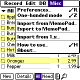
), the item is moved to the bottom of the list and struck through (unless you have "Hide completed items in need view" turned on, in which case they will disappear from the list view). The items at the bottom of the list maintain the prescribed sort order for the selected view, except that they are now grouped at the bottom of the list with the rest of the "checked-off gang." Interestingly, in All view, the items that are at the bottom of the list are those that are not needed (), items marked as bought () are above them, with items marked as needed () at the top of the list. As in Need view, each of these groupings maintains the prescribed sort order for the view.
  6. OK and Cancel buttons: Tapping the OK button will save the changes you have made in any and all of the preferences screens and return to the list view. Tapping the Cancel button will not save any changes and your preferences will revert to the state that they were in upon entering the preferences screen.

DB Preferences


Figure 2.8
The Database Preferences provide switches that affect the way the current database functions on your device.
  1. Automatically reset quantities: With this option checked, the quantity selected for each item will be reset to 0 (zero) upon running the checkout command. When this is left unchecked, then item quantities will maintain their current setting even through a checkout command. Having quantites reset to zero can be useful for many things, but people who often buy the same amount of each item in their list (2 loaves of bread, for example) will find that turning off this feature is best. Either way, consider how you use the list you're working on, and decide what you'd like to happen to the quantity for each item when you run the checkout command. An interesting side effect of having this feature enabled is that when an item has its quantity changed to 0, it will be automatically set to Purchased (or Not Needed) status. Similarly, if you set a zero quantity item to anything else, it will automatically be marked as Needed. Makes sense, but if you're not expecting that behaviour it can be confusing.
  2. Record item creation date: When checked, HandyShopper will enter the current date into the date field when you create the item.
  3. Record item completion date: This will cause HandyShopper to enter the current date into the date field of an item when you check it off. PLEASE NOTE that since HandyShopper only stores one date for each item, that the completion date will REPLACE the creation date, or any other date you give it. Similarly, if you change the date after completion, the new date will replace the old one. The ability to record the item creation and/or completion date is just an automated way to select the current date when an item is created or completed. Just remember that each item can only store one date.

    Figure 2.9


    Figure 2.10
  4. Per-store prices and aisles: Enabling this feature will allow you to record individual prices and aisles for each store for each item in your database. This is especially useful when comparing prices for the same item at different stores. Interestingly, the data for per-store prices and aisles is separate from the data for the price and aisle for an item with this feature disabled. For example, if you did not have this feature enabled, whenever you assigned a price or aisle to an item, it's stored for that item irrelevant of any of the stores. When you then enable the per-store prices and aisles feature, HandyShopper will ask you (Figure 2.9) if you want to copy the current price and aisle information to one of the stores, or even all of them. In the Per-Store Prices confirmation screen you can choose to copy both Prices and Aisles, Prices only, Aisles only, or Nothing (don't copy) from the regular price and aisle data fields to the per-store prices and aisles. You can even choose which store to copy the data to, or copy the data to ALL of the stores. If you choose to copy prices and/or aisles, HandyShopper will warn you (Figure 2.10) that your database size will increase as a result of the operation and ask you to confirm the action by tapping OK, or to cancel the opertaion by tapping Cancel. Unless you have hundreds of items all with price and aisle information, don't worry about the size increase, as it's unlikely to be overwhelming.
    If at some point you decide to disable the per-store prices and aisles feature, you'll find that the price and aisle information you entered before turning on that feature in the first place is "back" again. In reality, it was never gone, just inaccessible to you. It's an interesting feature, to be sure, which can be confusing when switching back and forth with this feature. The best thing to do is to either keep this feature enabled all the time, or never turn it on (for a particular list). Note that you can, however, see and edit price and aisle AND per-store price and aisle information when using HS2Edit for Excel to edit the list on your desktop computer. NOTE: If you have not entered any "normal" prices and aisles for items, and you have entered per-store prices and aisles, and you then switch off the per-store feature, then decide later to turn it back on, DO NOT copy price and aisle information during the per-store activation process. If you do, any data in the normal price and aisle fields will overwrite per-store data, even if the main fields are blank! As a result, you might end up copying empty fields over full ones, thereby losing much, or even ALL of your per-store data. This is another very good reason to choose a mode and stick with it. ;-)
  5. New items are Auto-delete: With this feature enabled, all new items will have their Auto-delete box checked. This means that when an item has been checked off as completed, and the checkout command is run, the items will be deleted from the database. Note that you must run the checkout command to have the items be deleted using this method. This is a useful feature when your list content is transient and does not often need repeating. HandyShopper does NOT archive deleted items like some of the built-in Palm applications can.
  6. New items are Taxable: This feature allows you to have all new items be marked as Taxable. Essentially the Taxable box is checked for you so that you don't have to do it. This is great for shopping lists which contain mostly taxable items (usually anything but food). Note that with Tax 2 enabled (below), both Tax and Tax 2 will be checked automatically by this feature.
  7. Currency: This sets the currency symbol for the current database. Any currency symbol can be entered, and this symbol will appear in the Total button (top of the Price column) and anywhere a price is displayed, including the Totals screen.
  8. Priority: This sets the default priority that all new items will be set to. Any new item created will have this set as its priority. NOTE: Each of the above three "new item" options (Auto-delete, Taxable, and Priority) affects only items created after exiting the preferences screen. This can be used creatively to create large lists with different default settings for new items. For example, if I had a list of actions in my memo pad of a high priority, I could set the Priority for new items to what I want them to be, then import the memo into HandyShopper so that all the imported items have the assigned priority, then change the Priority setting back to what I usually leave it on. Similarly, you can build prioritized lists from scratch without ever touching the priority for each individual item, just by setting the default priority, creating all the new items for that priority, then changing it and doing it again for other new items of a different priority. Confusing? Not if you just play with it and see what happens. :)
  9. Tax: The "main" tax rate for taxable items. This percentage will be added to the total calculated price when you run the Total command. Remember, this calculation is based on the price of the item, the quantity of the item, and the percentage of tax applied to the item. If an item is not marked as taxable, then tax will not be calculated for it. If you notice that the total in HandyShopper is different from the total on the store receipt, be sure to check the following: the tax percentage is accurate to what the store is charging; the price for each item is accurately entered in HandyShopper; the correct quantities are entered; and any coupons or discounts are accounted for. If everything is accurate, HandyShopper's total will be identical to the receipt total down to the last penny.

    Figure 2.11
  10. Tax 2: If this feature is enabled you'll be able to enter another tax percentage that can be additionally calculated for each item. This percentage is added to the main tax percentage and calculated on a per-item basis, since some items may have only tax, or tax 2 marked, or even both of them. Tax 2 is useful for areas where there are different and/or additional taxes for different kinds of items, such as a food tax and a non-food tax of different percentages. The Tax 2 entry field only appears when the box is checked (Figure 2.11)

Misc Preferences


Figure 2.12
The Misc Preferences is kind of an "overflow" screen at the moment. After HandyShopper began supporting Alarms on items, more space had to be made for these new preferences. This Preference screen will probably also have other options added to it in the future as more options are added to HandyShopper. For now, this screen has the preferences for how Alarms within HandyShopper will behave (Figure 2.12).
  1. Alarm sound: Pick the melody you would like to be played when an alarm within HandyShopper is activated. The selection available depends completely on your System MIDI Alarms database. If you've created or installed additional alarm sounds for your other applications, those will be available to HandyShopper. When any alarm in HandyShopper is activated, the sound selected here will be the one that is played. If "Default" is chosen, then the alarm sound set in your Date Book alarm preferences will be played. Strangely, once you have chosen a specific alarm, there's no way to go back to the "Default" selection.
  2. Remind me: This tells HandyShopper how many times you want an alarm to be played until you manually dismiss it by tapping the OK button on the notification screen. If you don't dismiss the alert, HandyShopper will replay the alarm until all the reminders have been played (including the initial alarm). You can choose Once, Twice, 3, 5, or 10 times.
  3. Play every: This is the delay between reminders. Each additional playing of the alarm sound will take place after this much time has passed since the previous play. You can choose intervals of 1, 3, 5, 10, 15, and 30 minutes.
  4. Show icons in title bar: The icon assigned to the list can be displayed to the left of the list name in the title bar or not. This is turned on by default. Turning it off can be helpful if your list name is long, or if you only use icons for the list name as a way of making it quick to find in a long list of lists.
  5. Color icons use white background: Sometimes icons can be hard to recognize when they are set against certain background colors. Turning this preference on will give the icon a small square white background so that it's easy to see and recognize. This is especially helpful when using a grayscale device.
  6. Show tip window when scrolling: The scroll bar in HandyShopper now functions as a "normal" scroll bar, but the cool functionality of the old "navigator" scroll bar is maintained in this function. With this preference enabled, if you tap and hold the scroll bar "handle" (the black rectangle within the scroll bar itself), then the tip window will appear. You can then move around in the scroll area and instantly see where you'll end up in the list. Refer to the List View Screen section for more information.
Different PalmOS versions have different alarm management features. In PalmOS 4.0+, there is an event manager that allows you to snooze an alarm, and even choose how long to snooze, and a button that allows you to go directly to the item causing the alarm. In previous PalmOS versions, such as the recent version 3.5+, there is a snooze button provided by HandyShopper, but this snooze has a permanent value of 5 minutes.


©2001 Greg Gaub